
Toward A Better Government Web Experience
GearLab partnered with the City of Boulder to perform a user needs assessment, documenting design requirements and specifications for a redesigned government web experience that catered to both residents and government employees.
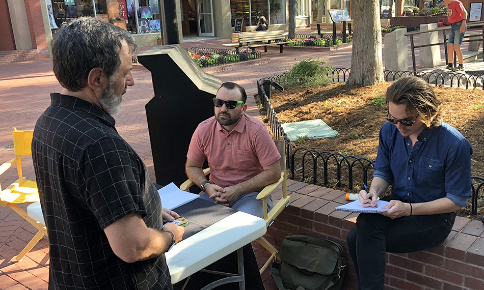
Photo taken by the City of Boulder.
Project/Client Goals
- Align user and stakeholder needs
- Provide a recommended information architecture with the goal of increasing findability for information
- Offer content governance guidelines for government employees to ensure information is easily accessible and digestible for residents
- Produce findings that are immediately applicable and beneficial to the user experience
Research Strategy
We employed a multi-method research approach to capture data across a wide audience of government and resident users. This approach included:
- Stakeholder Goal Setting Activities
- Employee Web Experience Survey
- Resident Web Experience Survey
- On-Site Feedback Collector
- Moderated Usability Testing
- Tree Testing
- Card Sorting
- Public Engagement
By gathering information from the aforementioned methods, we were able to triangulate findings to produce data-driven content and design recommendations for the City of Boulder website.
In total, we collected and reviewed data from:
- 5,323 feedback collector responses
- 325 survey responses
- Data on 15 tasks for tree testing with 61 users
- 312 goals (grouped and categorized) from internal stakeholders
- 6 moderated usability testing results
- 16 card sorting completions
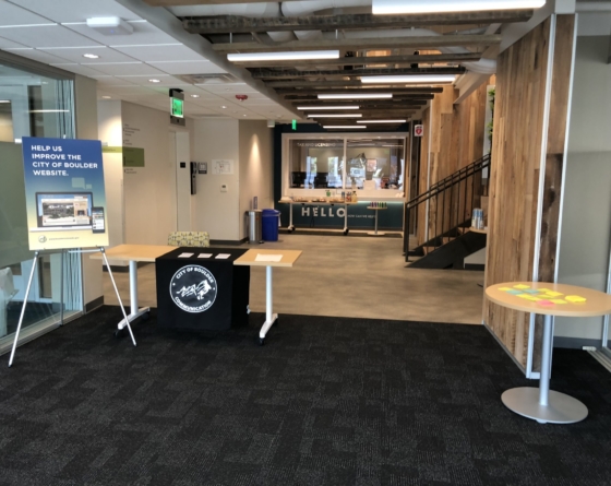
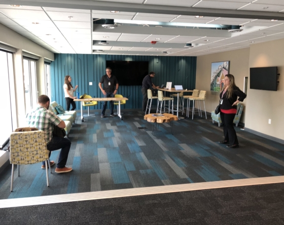
- Various information captured from two public engagement events
All research data was aggregated and analyzed with qualitative coding as well as statistical measurement for quantitative feedback. Spanning three in-person trips to the City of Boulder, we were immersed in understanding frustrations that both government employees and residents encountered while using the city’s website. Our goal was to zero in on the most impactful recommendations that we could offer to improve the website’s user experience.
Findings & Results
After concatenating research findings across methodologies, key themes emerged allowing us to provide recommendations that could be enacted immediately as well as data-driven design requirements for a future website overhaul.
One of the most prominent findings we uncovered related to the organization of content between various government departments. As we discovered in our City of Gresham case study, residents oftentimes struggle to understand what each government department is responsible for such as what information they govern, what forms they hold, and how/when to contact them to complete an action. To remedy this difficulty, we created and validated a group of Service Hubs that combined information from various departments into a centralized topic level location. Over thirty hubs were detailed holding content like: Pets, Animals and Wildlife in Boulder, Parking, Housing Services, and Transportation. These hubs were designed to match user language and served as a central location that aggregated content from various government departments. This no longer required users to have implicit knowledge of which departments govern specific information.
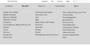
From two rounds of tree testing over 15 top user tasks such as “You’re looking for information about red light cameras in Boulder. Where would you find this information?” we were able to show a success rate increase of 21% over all tasks from 63% in the existing architecture to 84% in our proposed navigation. This increase will ultimately allow users to find the website content they are looking for more readily as well as decreasing phone calls to the city offices.
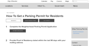
Further, we offered designed templates in the form of How-To Guides as well as strategically determining which website content would benefit from a step-by-step approach to increase the digestibility of the content. For the most part, this content already existed on the site, but organizing it in a more effective way would allow users to quickly scan content to determine the steps they need to take for tasks like applying for affordable housing or pet registration. Because this content existed previously, it was simply a matter of reformatting it with our proposed guidelines to allow for a more successful user experience.
Finally, the work does not end here. A main focus of this project was iterative improvement for the city’s website. Feedback collectors placed around the website collected information regarding if users were able to find the information they were looking for on specific webpages. With over 5,000 responses, we initially measured that users were finding the information they were looking for at roughly a rate of 72%. As iterative updates are made, we provide guidance on how to keep track of these metrics so that quantitative measurements can be made on where the website is improving and where it still needs work.
Deliverables
- Research Findings Report
- Design Requirements
- Recommended Information Architecture
- Wireframes
- User Personas
- Content Governance Guidelines
- Prioritized Executable Steps Guidelines
- Data Interpretation Training
